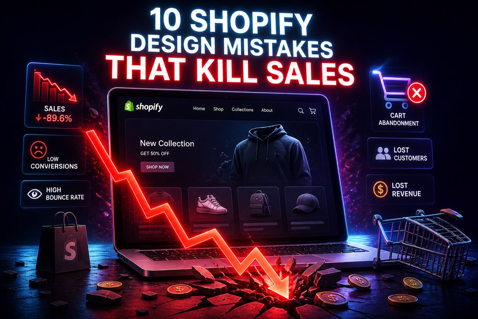
In the fast-paced world of e-commerce, you only have about 50 milliseconds to make a first impression. If your storefront is plagued by common Shopify design mistakes, you aren’t just losing visitors—you are actively killing sales.As a Shopify merchant, your storefront is your most important salesperson.
Many store owners focus heavily on products, ads, and marketing… yet overlook one critical factor: store design. At AdornThemes, we’ve analyzed thousands of stores to see what works. We’ve found that even with a premium theme, small configuration errors can lead to a “leaky bucket”—where you spend money on ads, but your website fails to convert that traffic into revenue.
If your traffic is high but your conversion rate is low, check your store for these 10 conversion-killing mistakes.
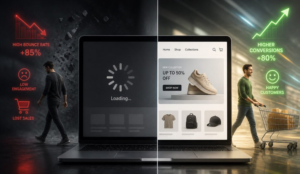
1. Slow Loading Speed That Drives Users Away
In eCommerce, speed isn’t a luxury—it’s a necessity. Modern shoppers expect your store to load almost instantly. If it doesn’t, they won’t wait—they’ll leave. Even a slight delay can create friction in the buying journey and reduce your chances of making a sale.
Why this hurts conversions:
A slow website creates a poor first impression. Users associate speed with professionalism and trust. If your store feels sluggish, it signals that something isn’t right—even if your products are excellent.
It also impacts your visibility on search engines, making it harder for new customers to find you.
How to fix it:
Instead of relying only on image compression or app removal, start with a performance-focused theme. A well-coded theme reduces unnecessary scripts, loads assets efficiently, and keeps your store lightweight from the start.
Also, regularly audit your apps—many stores unknowingly slow themselves down by installing too many. Our themes are built with Lazy Loading and clean Liquid code. This ensures that only the visible parts of the page load first, keeping your site lightning-fast.
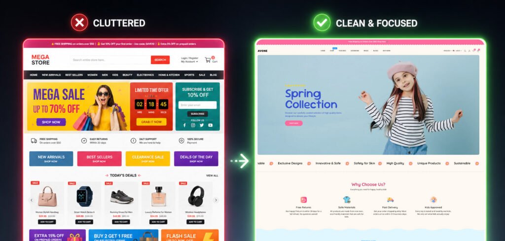
2. A Cluttered Homepage That Confuses Visitors
Your homepage is your digital storefront. Within seconds, visitors decide whether to stay or leave. A common mistake is trying to show everything—every product, every offer, every banner—all at once. The result? Chaos.
Why this hurts conversions:
When users are overwhelmed with too many choices, they don’t take action. Instead of exploring, they exit. Clutter also makes your store look unprofessional and reduces clarity around your brand.
How to fix it:
Focus on structure and hierarchy. Guide your visitors step by step:
- Start with a strong hero section
- Highlight key collections or bestsellers
- Use clean sections with breathing space
A well-designed layout doesn’t show more—it shows the right things in the right order.
3. Weak or Invisible Call-to-Action (CTA)
You might have great traffic—but if users don’t click “Add to Cart,” nothing else matters. If your “Add to Cart” button is the same color as your background or your brand’s primary pastel color, it won’t stand out. The eye needs a visual target. Many stores underestimate how important CTA design is.
Why this hurts conversions:
If your buttons blend into the design or don’t clearly tell users what to do, people hesitate. And hesitation kills conversions.
How to fix it properly:
Your CTA should stand out visually and psychologically. Use contrast colors, clear placement, and strong text like:
- “Buy Now”
- “Add to Cart”
- “Shop the Collection”
Also, features like sticky add-to-cart can make a big difference, especially on mobile.
4. Poor Mobile Experience in a Mobile-Driven Market
Today, most users browse and shop directly from their phones. Surprisingly, a lot of Shopify store still feel clunky on a phone,
Why this hurts conversions:
Small design issues—like tiny buttons, cramped layouts, or slow-loading images—become major frustrations on mobile. If users struggle to navigate your store, they won’t complete a purchase.
How to fix it :
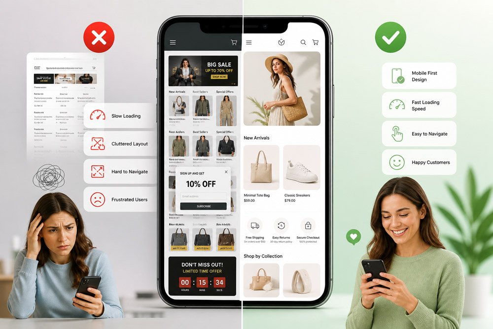
Adopt a mobile-first mindset. Test your store as a user would:
- Is navigation smooth?
- Are buttons easy to tap?
- Does the content feel readable?
A good theme should automatically optimize layouts for mobile instead of forcing you to fix everything manually.
5. Complicated Navigation That Blocks Discovery
Navigation is the backbone of your store experience. If users can’t find what they’re looking for quickly, they won’t search harder—they’ll leave.
Why this hurts conversions:
Confusing menus increase frustration and reduce product discovery, which directly impacts sales.
How to fix it:
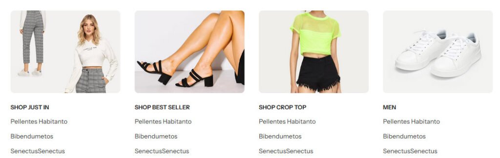
Simplify your structure. Use:
- Clear categories
- Logical grouping
- Mega menus for large catalogs ( show images )
Also, a strong search feature and product filters can dramatically improve usability.
6. Low-Quality Product Images That Reduce Trust
Online shopping is visual. Customers can’t touch your product—so they rely entirely on what they see. One single, low-res photo is a guaranteed sales killer.
Why this hurts conversions:
Blurry, inconsistent, or poorly lit images make your products feel cheap or unreliable. Even if your product is high quality, bad visuals will tell a different story.
How to fix it:
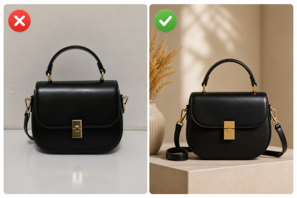
Invest in high-quality visuals: Provide at least 4-5 images: a white background shot, a lifestyle shot (in use), a close-up of the texture/material, and a scale shot.
Good images don’t just showcase your product—they sell the experience.
7. Missing Trust Signals That Create Doubt
Trust is one of the biggest barriers in online shopping—especially for new visitors. Online shopping requires trust. If a customer doesn’t see reviews or secure payment icons, they may fear their data isn’t safe or that the product is low quality.
Why this hurts conversions:
If users don’t feel confident about your store, they won’t risk their money. Even small doubts can lead to abandoned carts.
How to fix it:
Reinforce trust across your store:
- Add customer reviews and ratings
- Display secure payment icons
- Clearly show shipping and return policies
Trust isn’t built in one place—it’s built across the entire experience.
AdornThemes Tip: We include built-in Trust Badge sections and Testimonial Sliders. Placing these right under the “Add to Cart” button provides the final “nudge” a buyer needs.
8. Overloading Your Store with Popups
Popups can boost conversions—but only when used carefully. Too many stores rely on aggressive popup strategies that hurt user experience.
Why this hurts conversions:
Instead of helping users, excessive popups interrupt their journey and create frustration. This often leads to higher bounce rates.
How to fix it:
Use popups strategically:
- Trigger them based on behavior (like exit intent)
- Limit frequency
- Keep the design clean and relevant
A good rule: assist the user, don’t annoy them. Our themes come with built-in, elegant pop-up systems that allow you to set “delays,” so the user has time to fall in love with your products first.
9. Inconsistent Branding That Weakens Identity
Strong brands feel consistent. Weak ones feel scattered. If your store uses different colors, fonts, or styles across pages, it creates confusion.
Why this hurts conversions:
Inconsistency reduces trust and makes your brand less memorable.
Customers are less likely to buy from stores that feel unpolished.
How to fix it properly:
Create a consistent visual identity:
- Stick to a defined color palette
- Use the same fonts across pages
- Maintain uniform layouts
A well-designed theme makes this much easier by keeping everything aligned.
10. Poorly Structured Product Pages That Don’t Sell
Your product page is where decisions are made. If it lacks clarity or structure, you lose sales—no matter how good your traffic is.
Why this hurts conversions:
Customers need information, reassurance, and motivation—all in one place. If your page feels incomplete or confusing, they won’t move forward.
How to fix it properly:
Design your product page strategically:
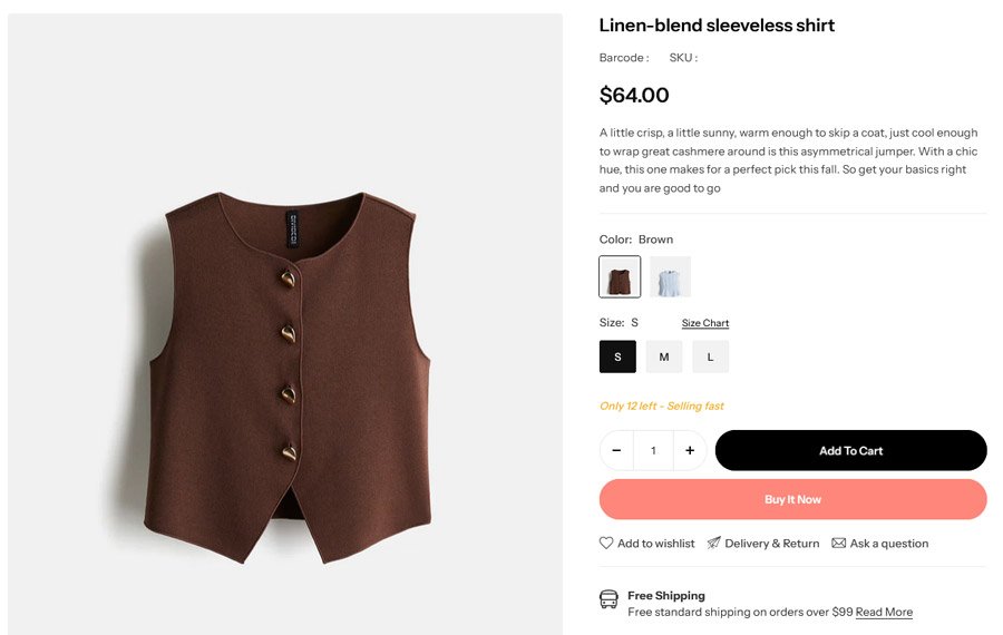
- Clear product title and pricing
- High-quality images
- Benefit-focused descriptions
- Reviews and trust signals
- Strong CTA placement
A great product page removes doubt and makes buying feel easy.
Conclusion: Is Your Design Working for You or Against You?
A high-converting Shopify store is the result of hundreds of small, smart decisions. You don’t need a million-dollar budget to fix these mistakes—you just need a theme that was built with these rules in mind.
At AdornThemes, our multipurpose Shopify themes are engineered by e-commerce experts to solve these 10 problems automatically. From mobile-first layouts to built-in conversion tools, we provide the foundation you need to stop losing sales and start scaling.
Ready to transform your store? Explore our Premium Themes on ThemeForest
AdornThemes is a Power Elite Author on Envato. We specialize in high-performance, SEO-optimized Shopify themes that help merchants win.