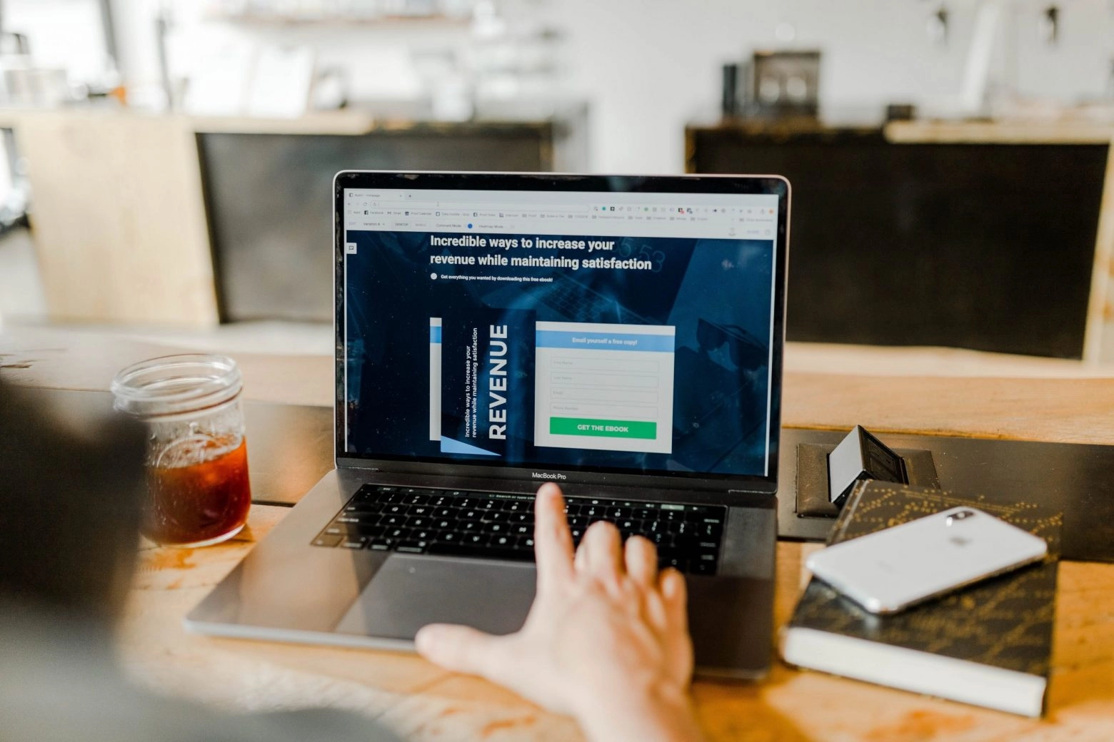
When you come across a website, the main thing that catches your attention is its design and organization. The landing page is mostly visual. The brain processes visual information 60,000 times faster than text. This is why an appropriate design is one of the main key points while developing the web site. It can significantly increase the conversion rate. How to reach this goal? Let us discuss the 10 main web design principles to help you boost the site.
Make It Simple
Remember the rule that less is more. Your site should be easy to follow and understand. If you want to convert users, make sure that they do not face any obstacle on their way to performing the action.
According to Hick’s Law, the amount of time spent making a decision depends on the number of options available. The wider the choice, the longer a person will be choosing. If there are too many options, the user might simply leave your page. In other words, fewer options equal a higher conversion rate.
Use only one call-to-action button and a few form fields. The more information you request, the lower the conversion rate will be. Adding a field for a phone number, for example, decreases the rate by 5%.
Visitors do not thoroughly read the text on the site. They skim it quickly, watching it mostly in an F-shaped trajectory. Therefore, users pay attention to the first paragraph. Make it easier to study the text by breaking it up into small paragraphs, using subheadings, lists, and keywords.
Use The Rule Of Thirds
The Rule of Thirds is a renowned visual principle which can also be applied to web design. A simple principle to help improve your website design and make it more user-friendly. Dividing the screen into three parts vertically and horizontally, you will see four points where all the lines intersect. It is in the central part of the screen.
To make it easier to navigate the site, place important elements precisely at these intersections. Visitors will begin to pay attention to this particular content more often. As a result, they will become more receptive.
Mind visual quantity balance
Another important point to enhance the conversation rate is to follow an adequate principle of adding visual elements to your web page. Namely, mind the size and weight of the images. Why? While the ultra-fast Internet connections are not working around the world anywhere in the world, many users still have limited access to the network.
Just imagine how a person who is far out of town is feeling and trying to load a page of an online store with large images to recommend a product to a friend. Most likely, this user will switch to another service that is better optimized. In addition, such a site loads content way faster.
One more point is to mind the psychological point dealing with laws of empathy. It is the social essence of a person. The faces of happy people on your site increase the level of trust among users on the subconscious level. Moreover, if they also fit in your target category, then the conversion will be even higher.
Use Negative Space
Web design blanks belong to negative spaces. On the contrary, positive ones are all the elements that your site contains. Negative spacing includes more than just blanks between large page parts. It also consists of the space between all the homepage’s details. For example, the distance between points, lines, and letters. Here are some tips to make sure you fulfill the possible negative space:
- If you use a small font, you should leave a small space between the letters;
- The space above and below the line of text along with the text itself should be approximately 150% of the font size;
- Divide large parts of the text into smaller ones;
- Add negative space between large elements of your homepage like menu, title, and content, using wide page margins and line spacing.
Paying attention to all kinds of your homepage negative space can make it more comprehensible. Your visitors will appreciate it as they can instantly understand the site’s concept. All this leads to an increase in the conversion rate.
SEO Optimization
Even if you have done all the above work involved in the design, it will be no use providing you neglect the SEO optimization. It includes the process of link building and appropriate content creation. Adsy provides promotion services for all who want to enhance their homepage effectively. Obtaining valid backlinks and website content are two important points for the conversion rate. If users notice some mistakes and low-quality content, they definitely will no longer visit such a page.

Pay Attention To Colors
Colors affect the way the visitors perceive your site and how they interact with it. There is not a perfect palette to fit any page. However, understanding the psychological impact of colors can help you predict how users will react.
The color wheel of renowned psychologist Robert Platchik will allow you to determine which emotions evoke different colors, and even shades. Colors affect the central nervous system, you cannot sleep on their effect.
Combinations of different color schemes, especially if you connect associations, can play a key role in the perception and memorability of a site’s brand. They are not only psychological triggers but also important elements of branding. They increase brand awareness by 80%. For example, when we think of Tiffany & Co, their trademark shade of blue immediately pops into our minds. This photo retouching website also used such colors to enhance the converse more than 23%.
The choice of the contrasts, the connection between color and emotion is very important and often underestimated by web designers. Color can also help highlight the most important elements of the page, such as the buy button. This simple step also demonstrates your desire to simplify site navigation for potential buyers and save their time.
Choose Adequate Fonts
Font is another main key point your users pay their attention to. They have a huge psychological impact on visitors as well as the site’s color selection. If you use too many different fonts, you simply confuse users. And vice versa, if you apply a few of them, it will make the site look boring.
You should use more than one font but proceed with caution. They should complement each other. All pages on your site should appear linked. Remember, in the first place, the font should be easy to read. In other words, do not choose them, according to their attractiveness.
Stick To The 8-Second Rule
The rule is simple: you only have 8 seconds to catch the user’s attention. A person can concentrate this duration on one thing. It is based on the fact that you have not a great variety of opportunities to interact with the users when they go to the site. Therefore, use these precious seconds wisely.
Here are some tips to attract visitors in the first 8 seconds and increase conversion rate:
- Come up with a conspicuous and condensed headline, which tells about the advantages of your services;
- Use captivating visual content that clearly expresses your page purpose;
- Make the call-to-action button big, simple, and straightforward;
- Use stylistically special words to make your offer more attractive;
- Use media content like video, audio, and so on.
It is important to consider the average users’ preferences. In other words, become a site’s visitor yourself. Just think what would attract you in the first place as a potential customer/user, and start creating a perfect design.
Site conversion clearly demonstrates its effectiveness in terms of the percentage of visitors who have performed what the site owner wants them to do – view the content, buy a product, or subscribe. At the same time, the desired conversion is a rather difficult result to achieve. Hard work and constant monitoring of trends can help you to achieve ratio improvement.
High-quality web design is a combination and adequate balance of visual elements, technical optimization, quality of text content, and, of course, easy navigation. Focus on the best possible presentation of your brand and appropriate web design and your homepage conversions will increase instantly.


