You can set a global style for products displayed in lists on the homepage, collection page, and product page. Please note, however, that the grid style for products may be overridden by the grid settings of individual sections.
In the theme editor, click Theme settings -> Products grid
Grid Style : You can choose grid style from four different option.
Remove collection name? : Enable this option to eliminate the collection name from the product URL
Grid Spacing : Set space between two grid box for desktop view.

Grid Spacing(mobile) : Set space between two grid box for mobile view.
Grid Images :
Ratio : Set products grid images ratio to landscape, portrait or square based on your image dimension.
Border Radius : Set product grid images corner to rounded.
Color Swatch : Enable to show color swatch on products grid. Choose swatch type to Color Swatch Or Variant Image.
For Color Swatch, make sure you have define all colors. Please go through this article to add colors for products.

For Variant Swatch, Please make sure you have uploaded variant images From Shopify admin > Products > Select product to add variants > Scroll down to Variants.

Variant Image Position : Set variant image position. Set variant image position. Either you can set to display it from center or top.
Swatch Size : Select swatches size in px.
Border Radius : Set rounded corner for swatches.
Set Swatch border and active swatch border color.
Max Colors to show : Set the number of colors you wish to display on the grid. The remaining colors will become visible when the user clicks the plus button.
Products Title : Set font size, font weight, text case and title color for product title in grid. Shorten title to one line? You can enable this option to display the product title in one line if the title occupies two or three lines. With this, title text will be truncated.
Products Price : Set font size, font weight, price color and format for the price to be displayed products grid.
Grid Buttons : Add to Cart, Wishlist, Quickview Icon : Set Icon color, background color and border radius for icons. Also, control the visibility of buttons for both desktop and mobile views.
Countdown Timer : Enable this option to display countdown timer on products grid. You can enable count timer to promote items on sale. Set text and background colors.

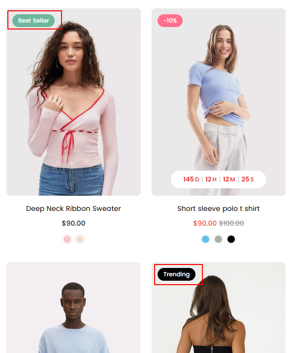
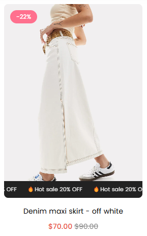
Product Badge/Labels : Enable to highlight products or display sale or sold-out label on items. Learn more
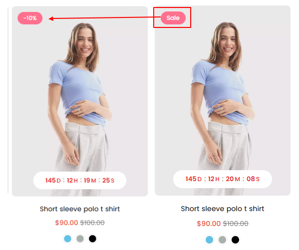
Sale Label : Enable to display sale label on products. Show when compare price is greater than regular price.
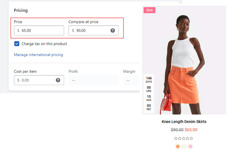
Show as : Select how you want to display sale label. Text based or in percentage
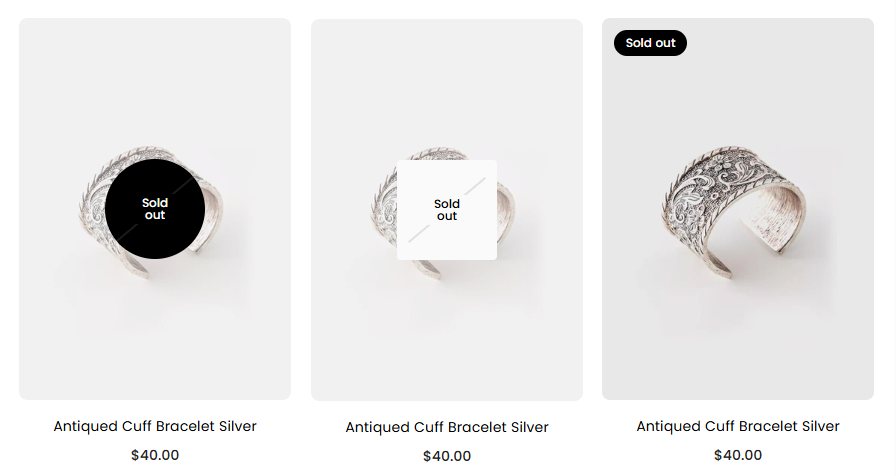
Soldout Label? : Enabling this option display sold out label on product when product is out of stock.
Custom Labels : Please follow given article to set custom labels like Best Seller, Top Rated, Hot, New etc
Scrolling Text : Scrolling text is a great way to showcase promotional messages or highlight special information about specific products that grab users’ attention.
Other Options : Additional product settings such as display reviews, subtitle, vendor information, border, and text alignment.